8 Proven Tactics to Sell More Products as a Creator
It’s the age-old question we get 10x / day. From casual conversations with creator friends at Gold’s Gym in Venice, to first conversations with potential partners, to weekly or monthly strategy calls we do with our longstanding partners.
“My challenge / guide / program / cookbook / [other product] is the best thing since sliced bread. How do I sell more of them?!”
The good news is... there’s an answer!
In this article, we’re going to cover the 8 proven tactics that ALL creators can do to boost sales of their digital products. Here's the TLDR:
- Eye-popping designs --> can increase conversion 200%+
- Enable multiple payment options --> reduces cart abandonment
- Show reviews on your landing page --> provides social proof
- Add client transformations --> provides visual social proof
- Have a community for your product --> enables viral growth
- Offer flash discounts --> drives FOMO
- Offer a money-back guarantee --> alleviates concerns
- Be confident in what you're selling
How do we know these things work? Because we’ve A/B tested them across millions of page visits and nearly 1,000 sales pages over the last 3 years.
Keep reading for more details, analysis, and visual examples for each of the 8 proven tactics.
1. Eye-Popping Design
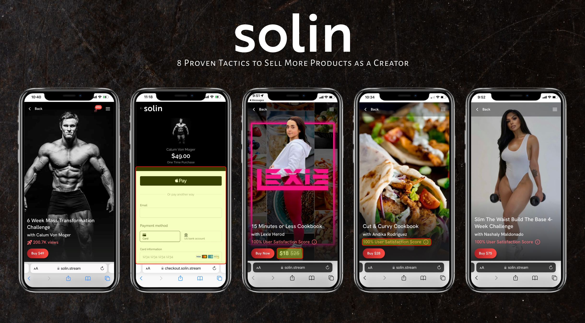
Why does this work? According to a press release from InfinityHR Solutions, first impressions are 94% design related. Users immediately notice the look and feel of your landing page and will make a snap decision from there on whether they want to continue scrolling, and ultimately purchase.
A study by Forrester Research showed that "a well-designed user interface could raise your website's (or software's) conversion rate by up to 200 percent."
What does this mean for you? Your first picture must pop off the page, and your site must be optimized for mobile, which is likely where the vast majority of your traffic is coming from.
Bonus points if you can add simple, sleek animations to your page. This provides a special ‘feel’ to your page and sub-consciously communicates that you invested in your page and your underlying product.
Check out an example of a high-converting page below:
2. Enable Multiple Payment Options
Why does this work: Cart abandonment in e-commerce is incredibly high. According to Baymard Institute, 69.57% of online shopping carts are abandoned. This means that about 7 of every 10 people that add your product to your cart abandons.
As an example, if you sell $10,000 / month with a typical cart abandonment rate, you would sell $20,000 / month if you could cut your cart abandonment rate in half. That's $120,000 more each year! Reducing your cart abandonment rate is crucial.
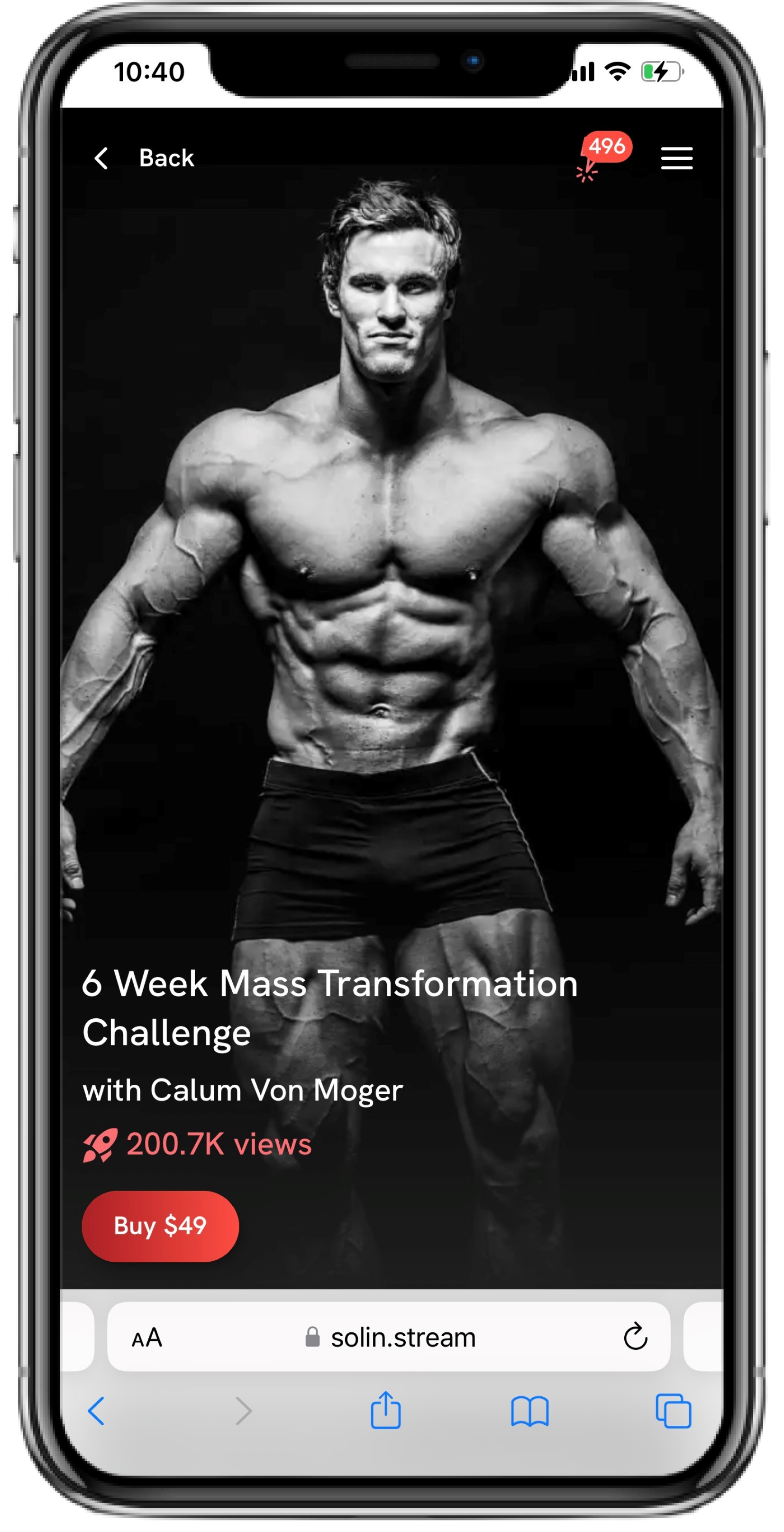
One of the primary reasons for cart abandonment is friction in the checkout process. If you can offer things like Apple Pay, Google Pay, and other payment methods so that people can seamlessly checkout, you will reduce friction and increase conversion rates drastically.
When choosing where and how to sell, make sure you optimize your checkout flow. Consider using Stripe Checkout, which is what we’ve implemented at Solin. It is optimized for conversion globally and has been shown to increase sales as much as 46% after implementation.
Here's an example from a Solin checkout page:
3. Show Reviews on Your Landing Page
Why does this work: reviews provide social proof. The same way your number of followers on Instagram matters, the number and quality of reviews on your landing page matters.
Reviews show that other people enjoy your product and that it is not a scam (which is unfortunately all too common in this industry). Of course, if your reviews are terrible, then you should probably go back to the drawing board on your product – but assuming your product is good, you’ll have good reviews, and you should showcase them!
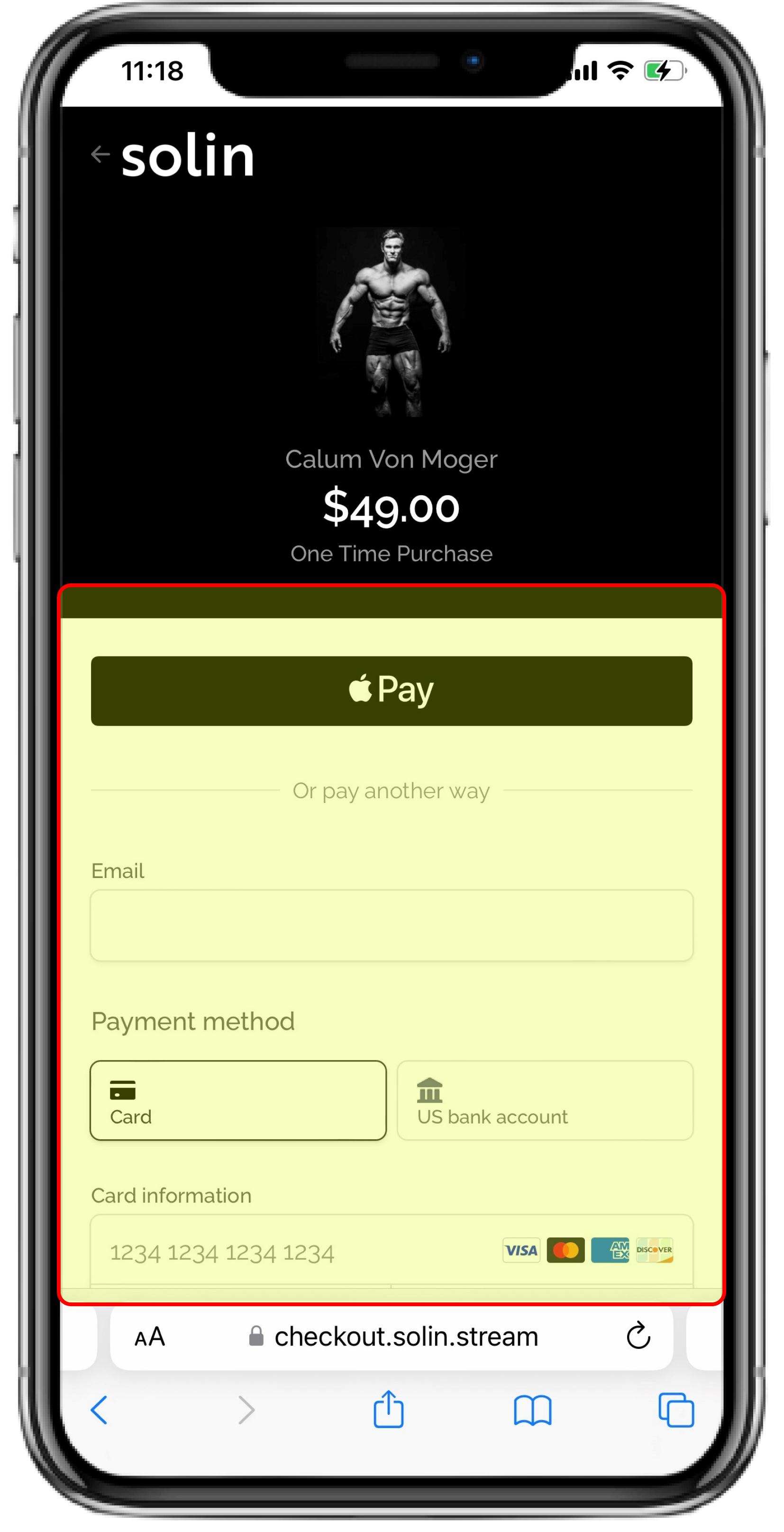
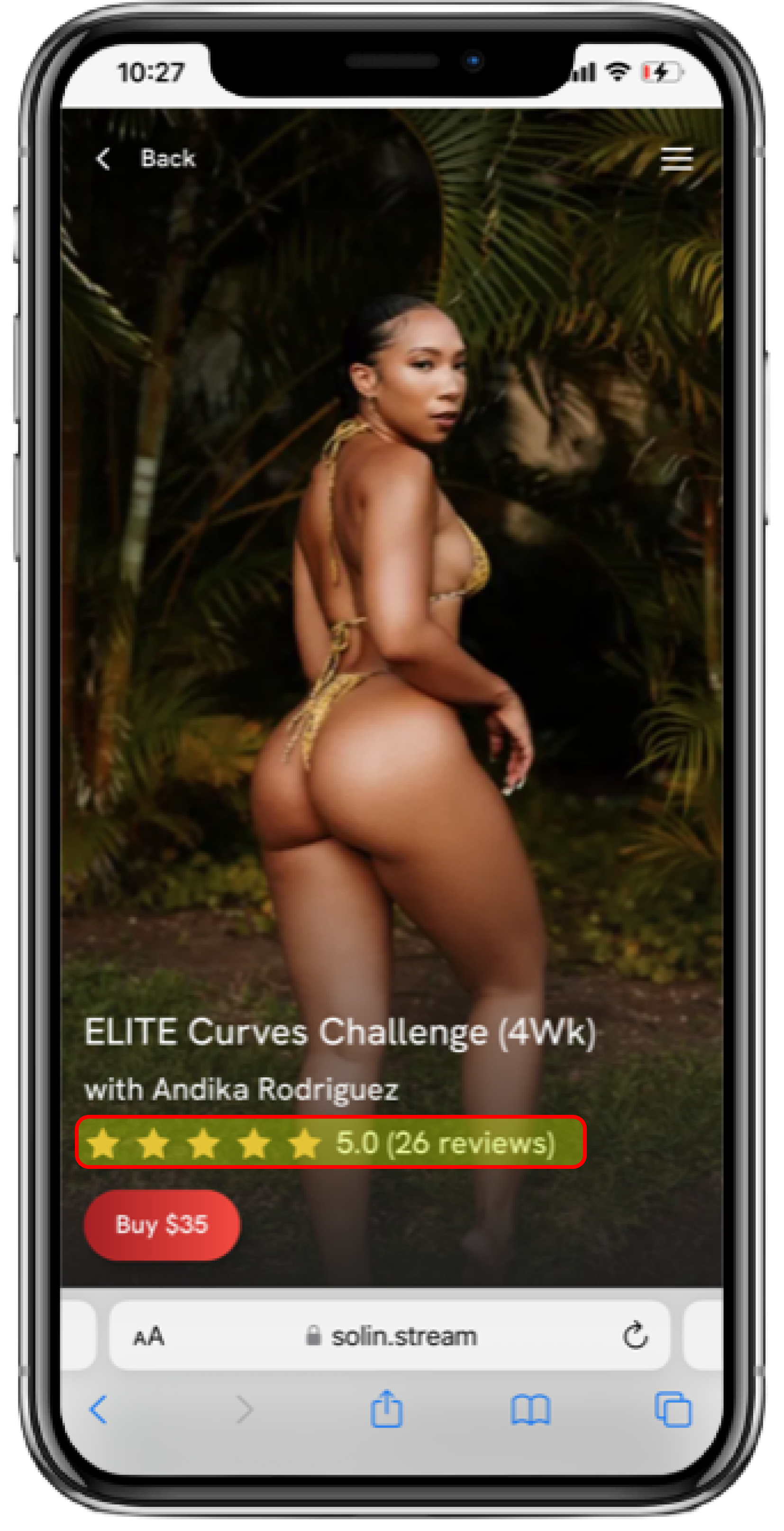
Examples from a Solin landing page below:
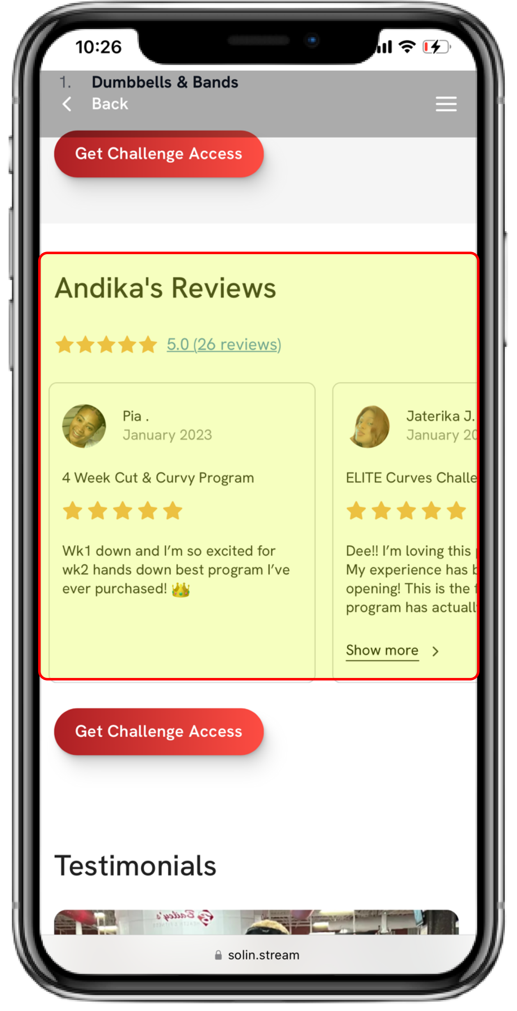
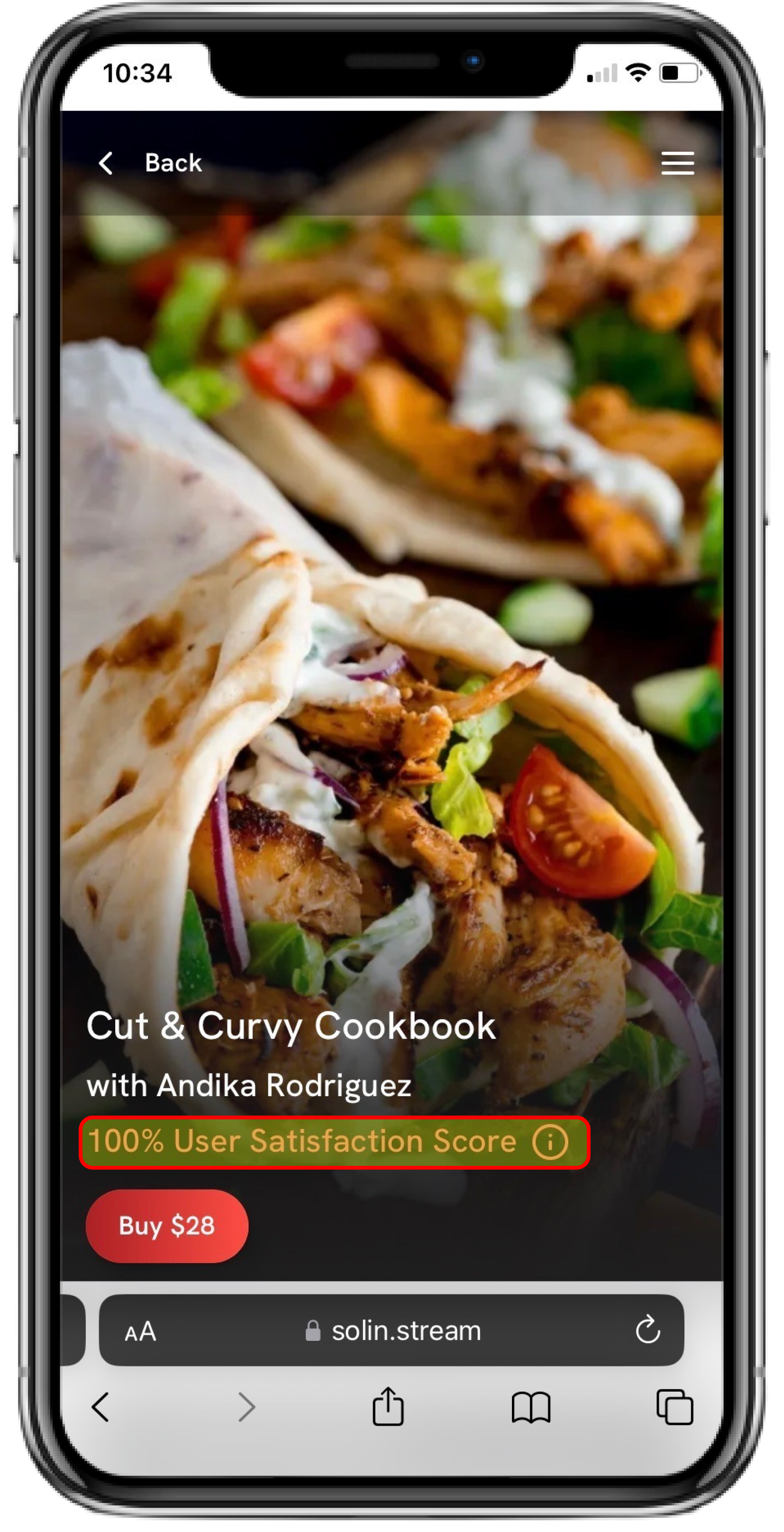
Bonus points for the following:
1. Adding a review summary: If you can, show a review summary (e.g., 4.9 / 5 stars) towards the top of the page, and all individual reviews lower on the page, as you see in the picture above.
2. Third-party verification: Have your reviews verified by a third party. Platforms like Solin do this automatically, but you can also do this on other sites with an integration. People know reviews can be fake, so third-party verified is the gold-standard. If you can’t do this, non-verified reviews are better than nothing!
3. User satisfaction score: Consider showing a user-satisfaction score out of 100% rather than reviews out of 5 stars. When we added this to the Solin platform in place of the standard 5-star review scale, it led to a big uptick in sales. You can see an example of this in the picture to the far right above.
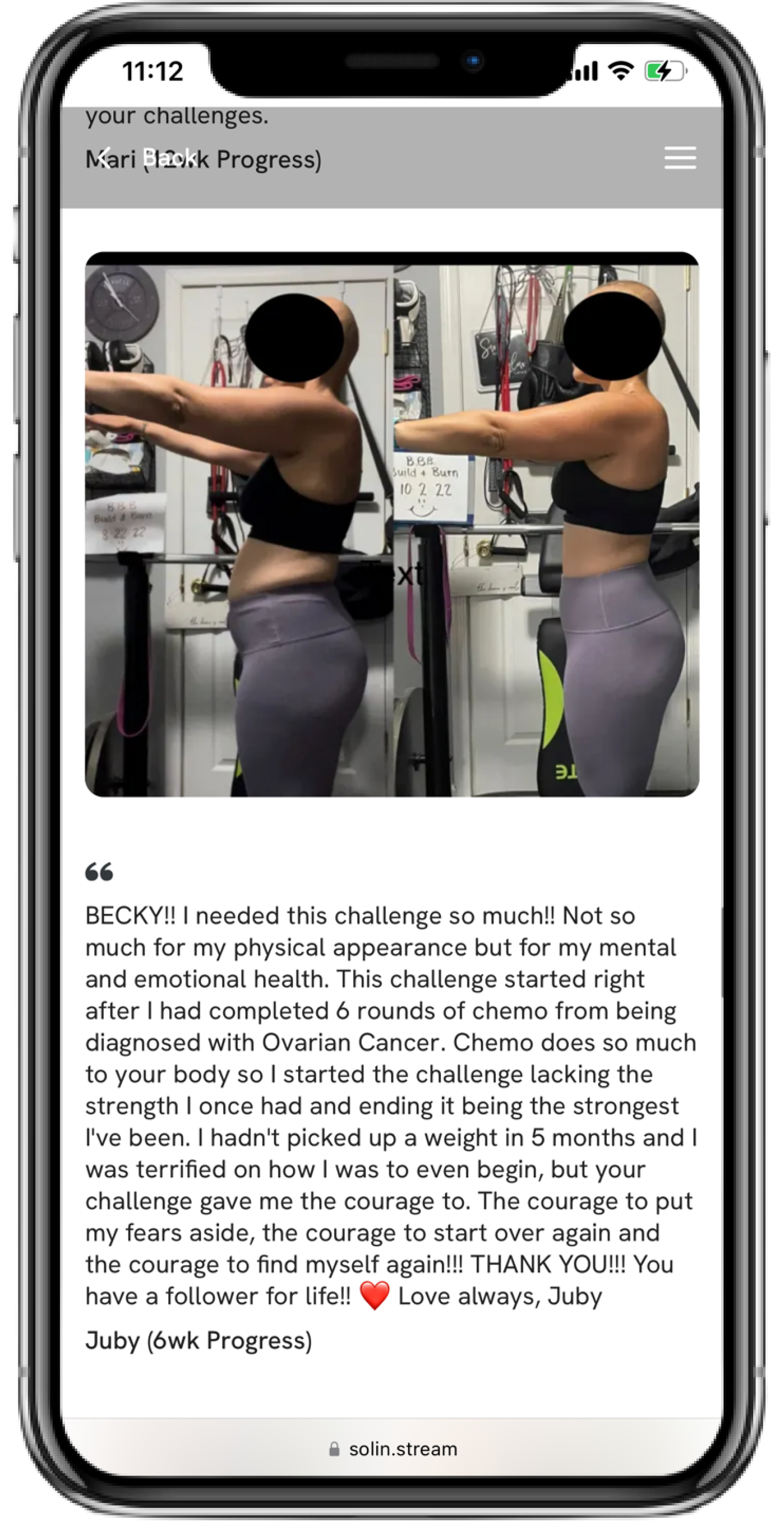
4. Add Client Transformations
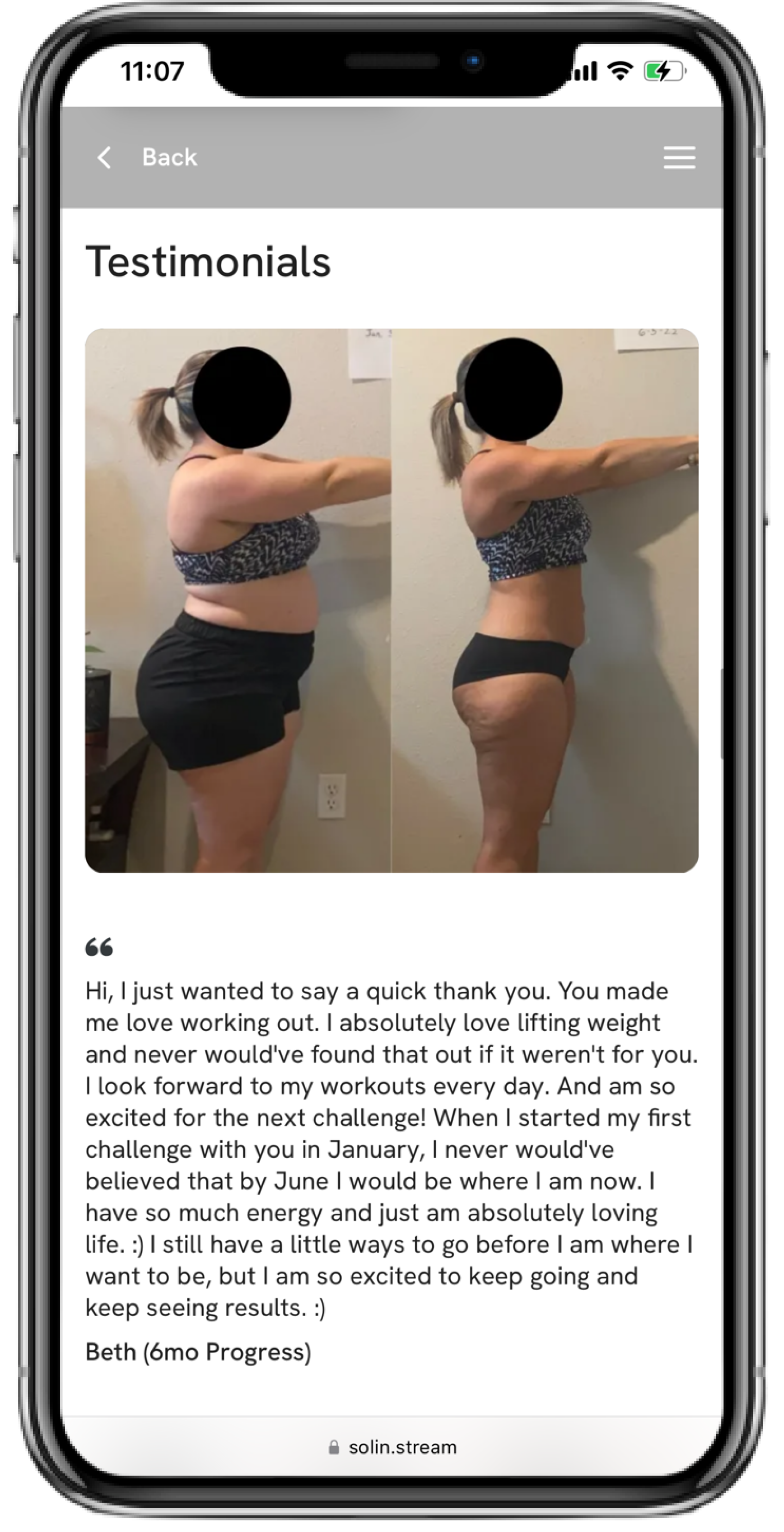
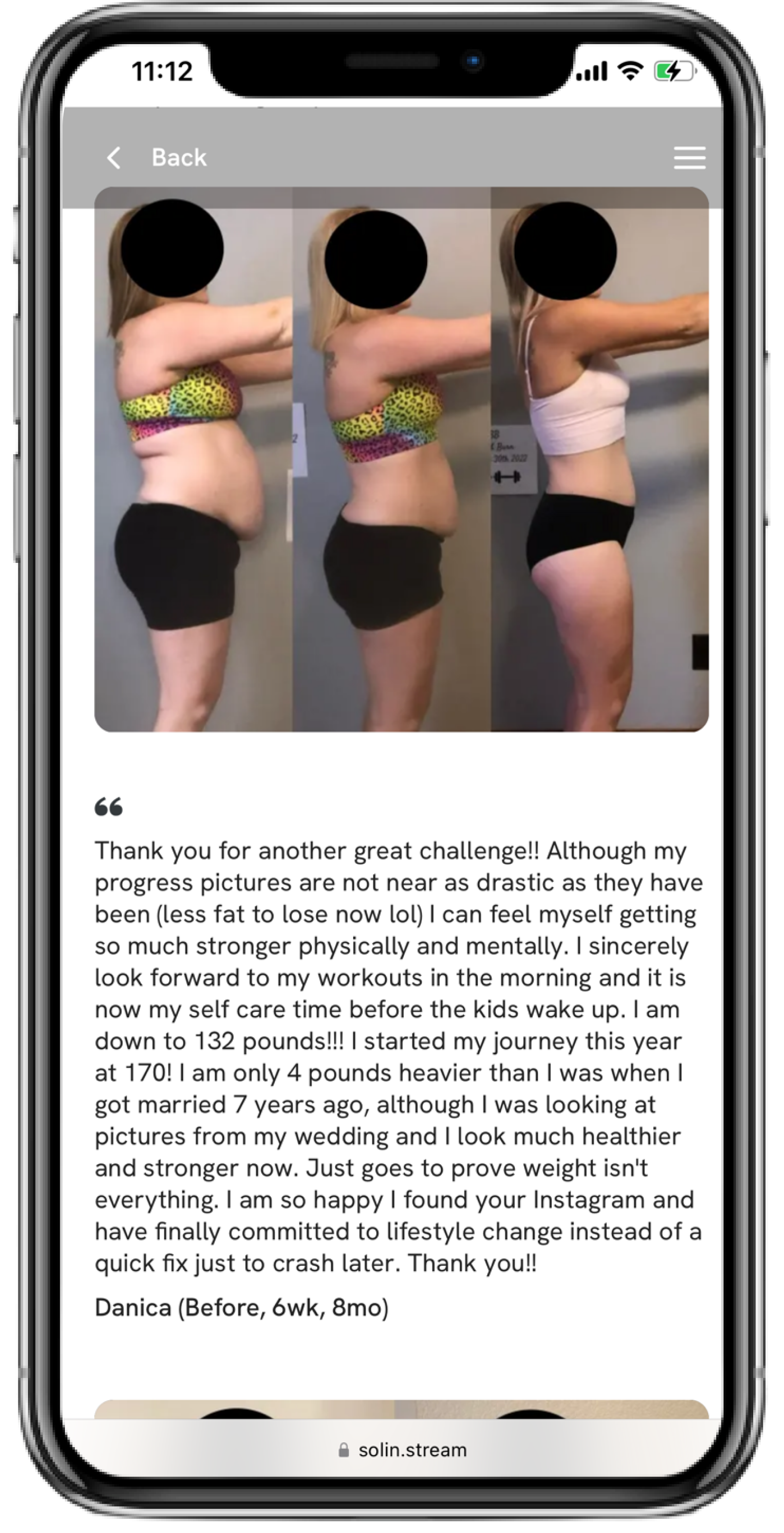
Why does this work: Transformations provide more social proof. This is the visual evidence that your program / cookbook / nutrition guide works, and helps people achieve their goals. Psychologically, these transformations allow potential buyers to visualize their own success.
Transformations are easiest in fitness and nutrition, but if your product is not specific to one of these industries, think creatively about how you can visually show them (maybe users are happier, more proficient in a skill, or something else).
Examples from a Solin landing page below:
5. Have a Community for Your Product
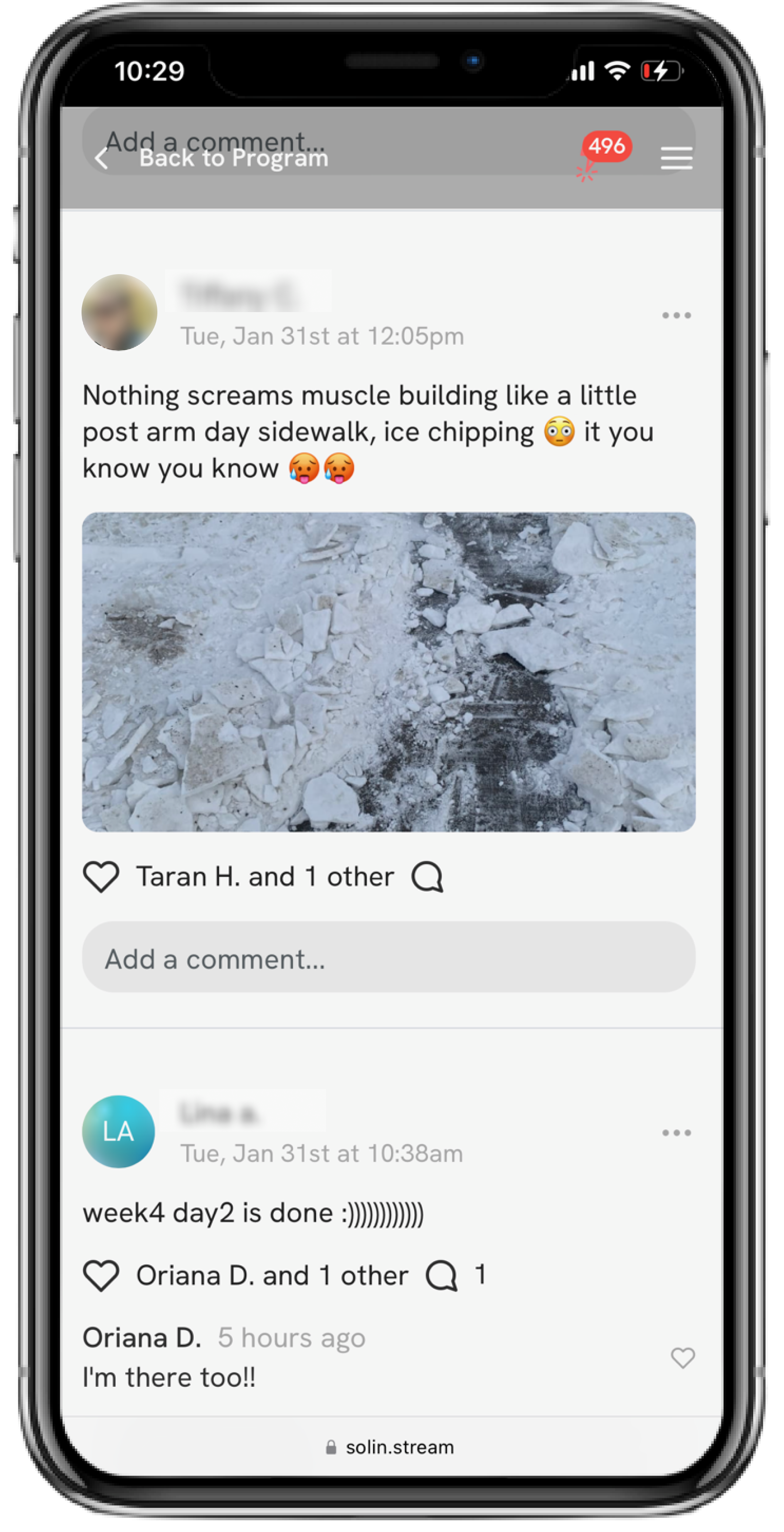
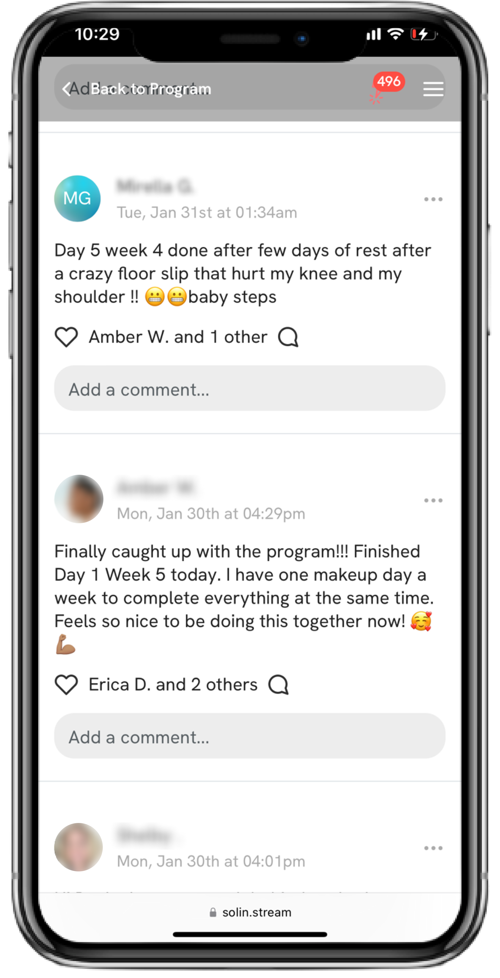
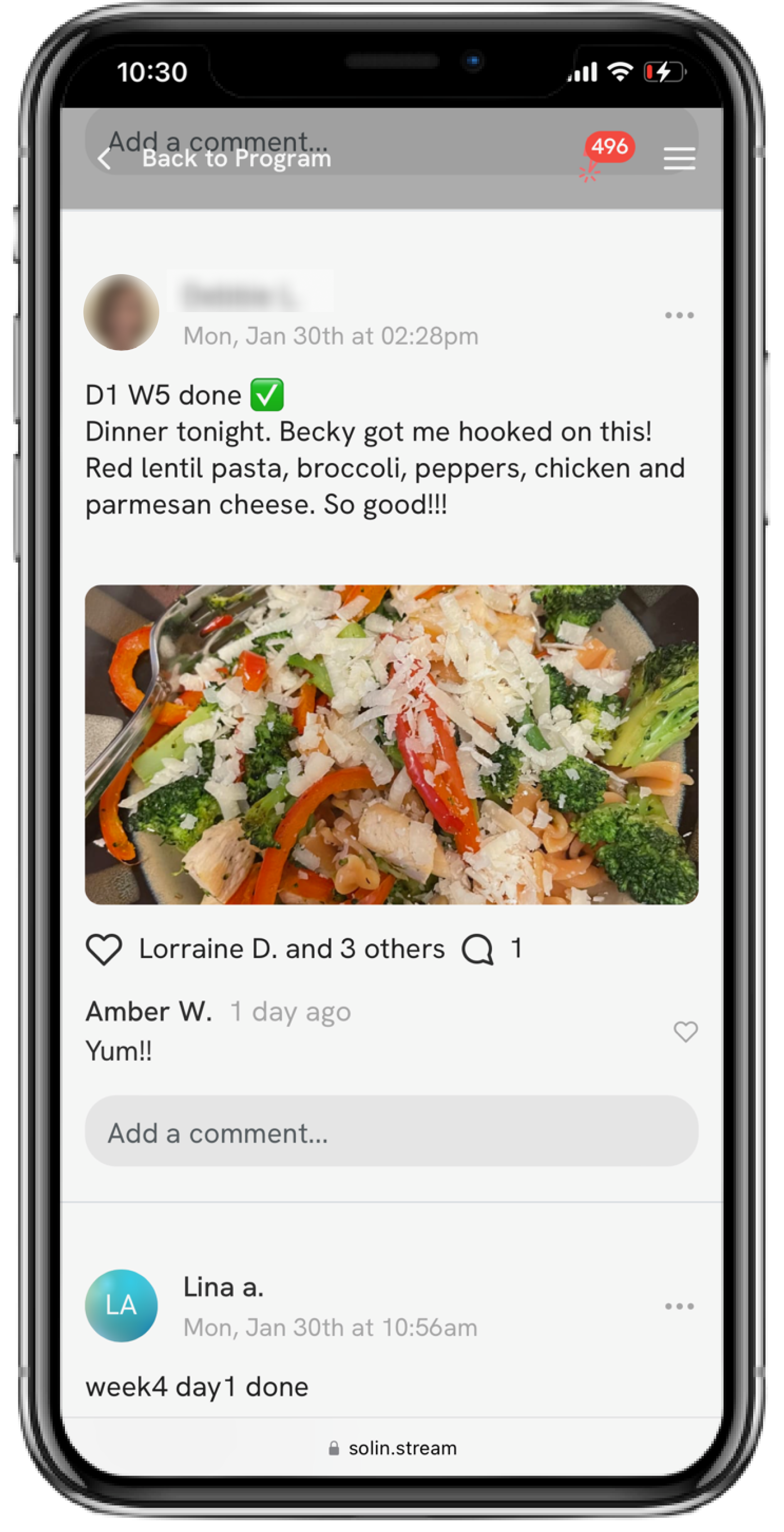
Why does this work: A community facilitates viral growth. When people engage in the community, they get excited – they feel like there are people doing this with them.
Further, community members will often want their friends to get in on the action, and invite them to do so. This is viral growth – when users of your program / guide / product invite their friends to purchase so they can all be in the community together. Here’s a detailed article on viral growth if you want to check it out.
Top Solin partners have tons of viral growth – they make thousands of dollars every month sitting back and allowing their community to share their product with their friends. This is the most powerful place to be as a creator.
A secondary benefit of the community is you can screenshot community posts and share them as testimonials on your social media. This is an authentic way to showcase how much people are loving your product & community.
Examples from a Solin community below:
Bonus points if your community is directly integrated with your product so that your users don’t have to go to another place (like Discord, What’s App, or Facebook) to hang out in the community. This will create a better user experience, more engagement, and give you a better chance to see true viral growth.
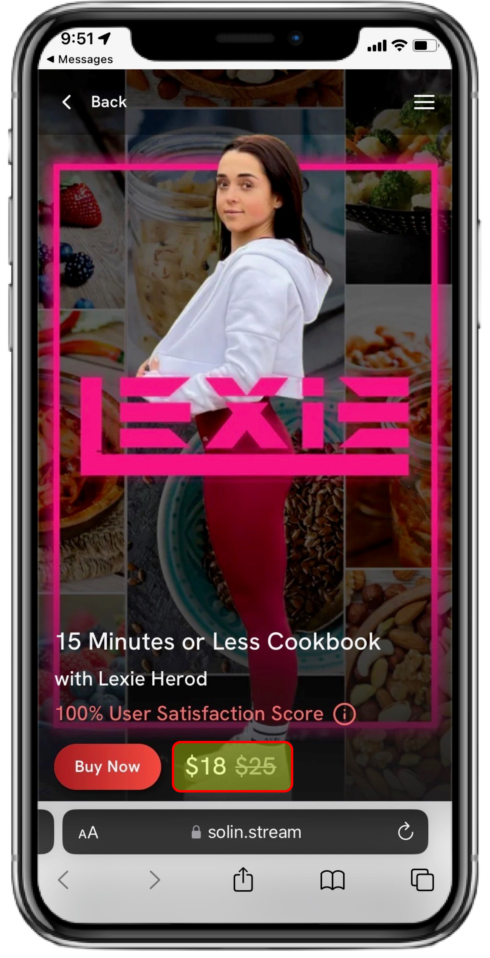
6. Offer Flash Discounts
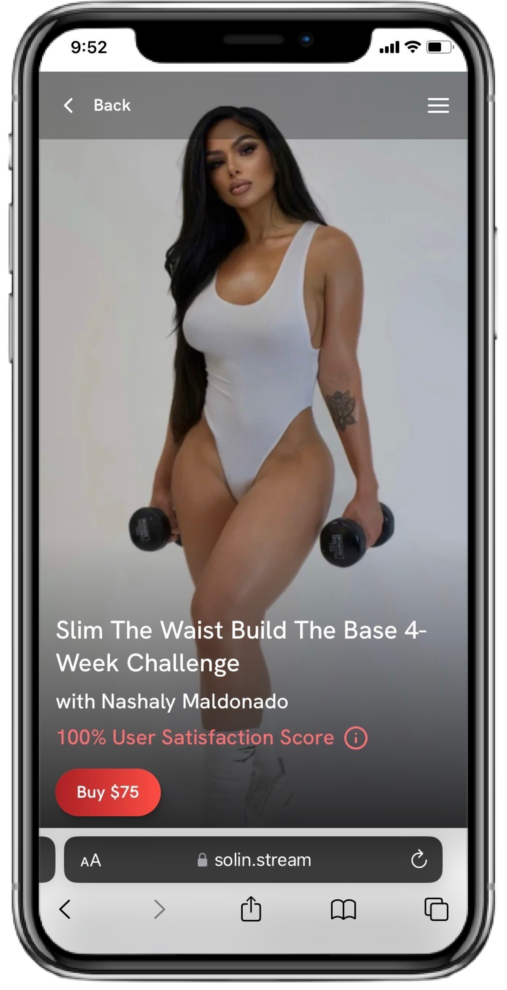
Why does this work: Flash discounts play on FOMO, or Fear Of Missing Out. When you run a discount for a certain period of time, it gives people a reason to buy now and take advantage of that discount.
Bonus points for turning your program into a challenge that starts on a specific date. This allows you to create even more FOMO, because people need to purchase by a specific date or they'll miss out on registration altogether. You can see an example of a challenge landing page in the picture below to the right. If you want more information on why challenges work so well, check out our blog post analyzing challenges here.
Examples from Solin pages below:
7. Offer a Money-Back Guarantee
This one may seem controversial. We get it, you don't want to offer a guarantee for a digital product that can easily be downloaded – that’s understandable.
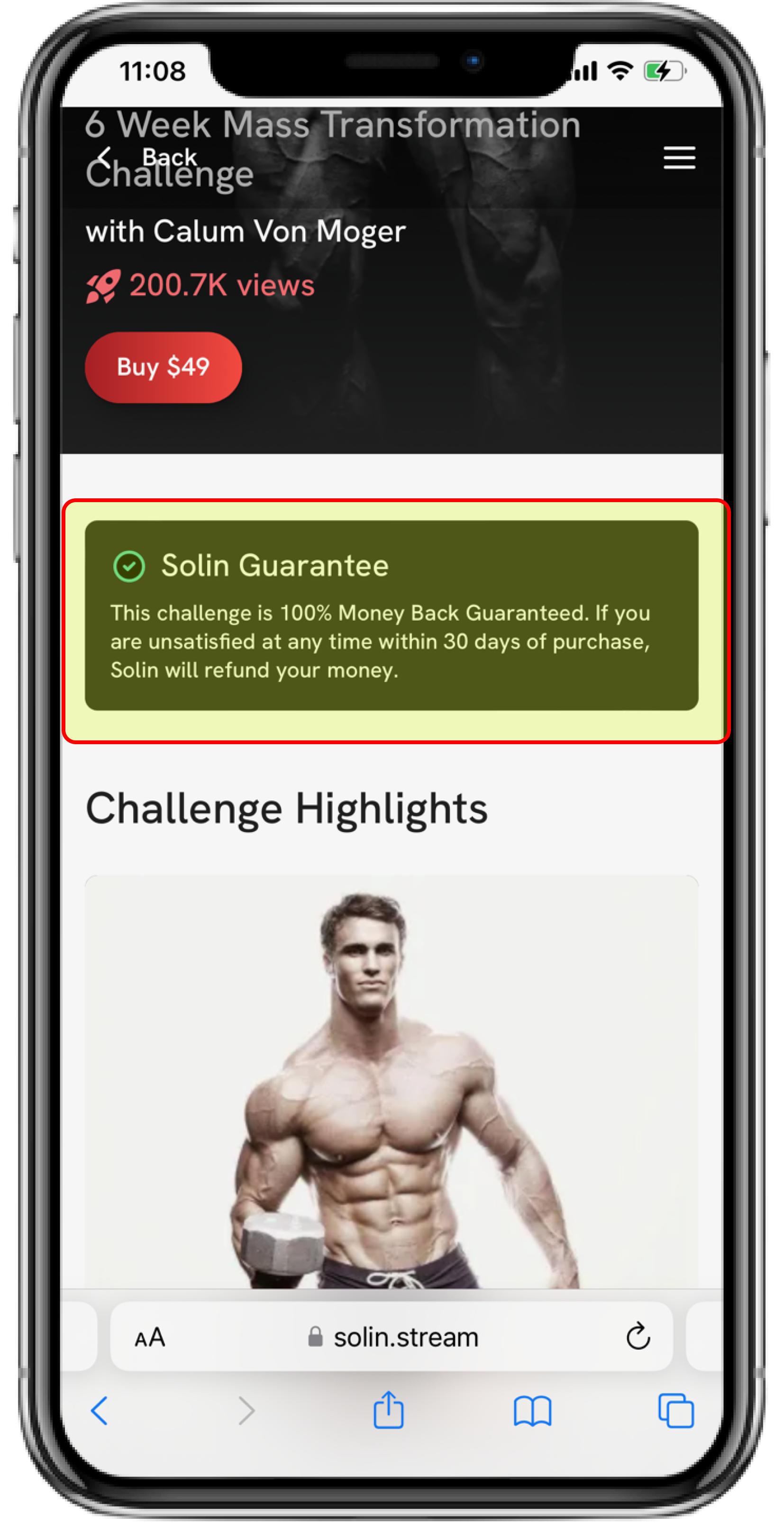
That said, a money-back guarantee adds another element of trust, and the VAST majority of purchasers are not actually going to take you up on it.
At Solin, we offer a platform-level 30-day money back guarantee on all products. We’ve analyzed the data and the numbers clearly show it’s worth it. We won’t share specific data from the A/B test, but let’s just say the 30-day money back guarantee was superior by a wide-margin :)
Here's an example from a Solin page:
8. Be Confident in What You’re Selling
This is the most important of all – if you are not confident in what you are selling, you aren’t going to be excited to promote it, you won’t get as many people to buy, and you won’t have a good baseline to work off. Get this right first. Make sure you are confident in your product, make sure it is authentic to you. And then focus on everything else.
When you're confident in what you're selling, you'll never feel guilty about posting all the time or talking about your product on your stories. You're just trying to educate your audience on why the product is going to change their lives. And when they buy, the product actually will change their lives! Create a product you're ultra-confident in, and everything else will fall into place.
How to Get in Touch
If you’re looking for a team to help you implement all these things, we’re happy to chat! We've already got all 8 tactics above handled and can start focusing on next-level growth levers like:
1. Advanced data analytics
2. Creative growth marketing
3. Reaching new audiences
If you want to schedule a strategy call with our team to see if we can be helpful, feel free to send an email to partners@solinfitness.com or schedule a 20 minute strategy call on our Calendly below :)
We'd love to hear from you!
Solin Website
Website: https://solin.stream
Instagram: https://instagram.com/solinstream
